1 From Dashboard to Decision-Maker
OpsPilot — Agent, Copilot, or Both? Locking The Product Category and Autonomy Model
· 8 min read
Product OpsPilot Strategy
You're reading Part 3 of 3 in the OpsPilot series.
Use the Series Navigation button at the top-right to browse all posts in the series.
Start from the beginning →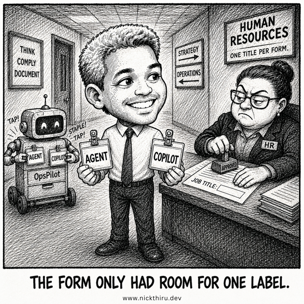
The User Moment
Picture the founder we’re building OpsPilot for. It’s 11 p.m., their inbox is a mess of failed payments, unanswered support tickets, and a dashboard nobody’s checked in three days. What they want isn’t another tool that suggests things to them. They want something that notices the failed payment, drafts the retry, and tells them when it’s done. Something closer to a quiet operator than a chatty assistant.
That distinction sounds small. It isn’t. It’s the difference between building a copilot and building an agent, and we didn’t actually know which one we were building until we forced ourselves to answer it. That question sat underneath every architectural decision that followed: what the interface would look like, what data it needed access to, what could go wrong, and how much trust we were asking the user to extend before they’d even seen the product work once.
The Design Problem
Here’s the tradeoff nobody warns you about: “Agent” is the word everyone reaches for right now, but reaching for it without checking is how you end up over-promising autonomy you haven’t earned. We had a long list of planned capabilities, and they didn’t all look the same. Some of them drafted a message and waited for a human to hit send. Some just surfaced information on a dashboard, no action involved at all. A couple were genuinely closer to “do this task end-to-end, no prompt required.”
If we called the whole product a Copilot, we’d be underselling the parts that ran multi-step workflows on their own initiative, quietly noticing a problem before anyone asked about it. If we called it an Assistant, we’d be pretending it only acted when asked, which wasn’t true either, since half its value came from watching things happen in the background without anyone prompting it. Neither label fit cleanly, and we couldn’t move forward on the architecture, the review flow, or even the pitch language until we picked one honestly.
This wasn’t an academic exercise. The category choice would directly determine how the product’s interface behaved. A copilot-shaped product suggests things inside an existing workflow: think inline recommendations, a sidebar, a “here’s a draft” moment. An agent-shaped product does things and then reports back, which means the interface has to be built around review and confirmation rather than suggestion and acceptance. Get the category wrong and you build the wrong screen.
The Options
We considered three categories seriously, and rejected two of them for specific, defensible reasons rather than gut feel.
Copilot was the tempting choice. It’s the familiar, safe-sounding word, and it comes with an established design vocabulary: inline suggestions, accept/reject buttons, a human doing the actual work with the tool whispering ideas. But a copilot’s job is to accelerate a human’s own output. It suggests. It doesn’t act on someone’s behalf out in the world. Several of our planned capabilities crossed that line outright. Retrying a failed payment and closing a resolved support ticket are actions taken against someone else’s system, not suggestions handed back to a person for their own execution. That’s a fundamentally different job than what a copilot is built to do, and pretending otherwise would have meant designing an interface that quietly hid the fact that real, consequential actions were happening under the hood.
Assistant was the other serious candidate, and it also didn’t survive scrutiny. Assistants are reactive by definition. You ask, they answer, the loop closes, nothing happens until the next request. But the core value we were building depended on the product noticing things and acting without being asked at all: continuous, background, cross-system monitoring that surfaces a problem before the founder even knows to look for it. An assistant framing would have quietly mis-described that as an on-demand tool, which undersells the single biggest reason the product is worth building in the first place. Nobody wants to have to remember to ask their tool whether a payment failed.
Agent is what we landed on, but with an asterisk worth stating plainly. A meaningful chunk of what the product does still looks and feels like copilot behavior: drafting things, surfacing ranked lists, summarizing a week’s worth of activity into something readable. What we realized, slowly and a little reluctantly, is that these aren’t competing categories fighting for the same territory. They’re layers. The product is an agent architecture with copilot-style moments embedded inside it, not one label or the other, but both, doing different jobs at different points in the same workflow. That reframing, more than the label itself, is the actual insight worth carrying forward.
The Build
Once we accepted that framing, the actual build decision got a lot more concrete, and a lot less philosophical. We went through every planned capability and asked one plain question: does this need a human to approve it before it counts as done? For almost everything that touched money, a customer conversation, or an external system, the answer was yes, no exceptions, no soft-pedaling. A few things, like dashboards, summaries, and alerts, were purely informational. No approval needed, because no action was being taken on anyone’s behalf.
That gave us a real, if unglamorous, first-version pattern: nothing autonomous, everything either informational or gated behind an explicit approval step. We ended up with a shape that didn’t fit a single textbook label cleanly, and that turned out to be the honest answer rather than a failure to categorize cleanly. We’re not replacing the tools founders already use at this stage, things like their accounting software or payment processor. We’re layering intelligence on top of what’s already there. And every action the product proposes needs a person to say yes before it fires, full stop. One dimension of the product behaves like a lightweight overlay sitting on top of existing systems. The other behaves like something you’d design if you were deliberately trying to earn trust before asking for more autonomy later. Naming only one of those two dimensions would have quietly hidden the other from whoever builds the next layer on top of this decision, which is exactly the kind of gap that turns into a painful redesign six months in.
The autonomy mapping exercise itself was more mechanical than glamorous, and that’s precisely why it worked. For every single capability on the list, not just the interesting ones, we asked the same blunt question and wrote down the answer. No capability got waved through on the assumption that “it’s probably fine.” A capability that touches a customer’s inbox got the same scrutiny as one that touches a bank account, because reputational risk doesn’t scale down just because the dollar amount does. By the end of the exercise, we had a complete picture, capability by capability, of what the product was actually allowed to do without a human present, and the answer, almost everywhere, was: not much, yet.
The real lesson was that forcing a single, tidy label onto a product before you’ve mapped what it actually does capability by capability is how teams end up building the wrong review flow, the wrong data model, or the wrong risk story entirely. We only got the label right because we refused to let ourselves round off the parts that didn’t fit neatly into one word. It would have been faster to just pick a word in the first meeting and move on. It would also have been wrong, and we’d have paid for that shortcut later, in rework, in user trust, or both.
The Verdict
Does this solve the problem? Mostly, yes, but with one honest gap I’m not going to pretend is resolved. Locking “agent, with approval gates on everything” gave us a defensible, buildable first version, and it forced a genuinely useful downstream decision: the review-and-approve interface became the backbone of the whole product experience, not an afterthought bolted onto a chat window after the fact. What I’d do if I were starting today: run this classification exercise before sketching a single screen, not after. We got lucky that it happened early enough to still shape the interface rather than force a retrofit later.
The gap: one capability, full end-to-end delegation with no human check at all, was explicitly punted to a later phase, because we didn’t yet have enough evidence to say it was safe to let it run alone. That’s not a loose end I’m dressing up as something else. It’s a deliberate, documented decision to wait, and I’d rather ship that honesty than pretend every capability landed in a tidy, resolved place on day one.
There’s also a quieter payoff here that took a while to notice. Once the category and autonomy model were locked, a lot of downstream arguments simply stopped happening. Nobody was debating anymore whether a given feature needed a confirmation step, because the answer had already been worked out capability by capability, months before anyone got near a design tool. That’s the real return on this kind of upfront classification work: not a cleaner pitch deck, but fewer arguments later, when the cost of getting it wrong is measured in shipped code instead of a whiteboard sketch.
Your Turn
If you’re building something with AI in the loop right now, where’s the line you’ve drawn between “acts on its own” and “waits for a human”? I’d genuinely like to know where other builders are putting that boundary, and whether it moved once you actually started shipping.
Have thoughts on this? I'd love to hear them. The conversation is happening on:
Now Building
OpsPilot
SMBs will be able to run their entire business with the operational efficiency and intelligence previously available only to enterprises with dedicated accounting, finance, customer support, sales & marketing, and operations teams.
Learn more and join the waitlist