1 Fast, Cheap, or Accurate…Why Not All Three!
PolicyForge — Why ranked results shouldn't be a black box
· 10 min read
Product PolicyForge Design
You're reading Part 10 of 16 in the PolicyForge series.
Use the Series Navigation button at the top-right to browse all posts in the series.
Start from the beginning →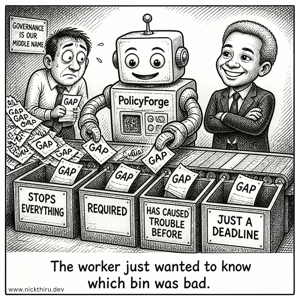
The User Moment
Picture the moment right after someone finishes answering PolicyForge’s guided interview about their security setup. They’ve told it about their cloud provider, their access controls, their data retention habits — the boring, essential stuff nobody enjoys typing out. PolicyForge takes that information, checks it against the framework they’re trying to get certified against, SOC 2 or ISO 27001 or HIPAA, and comes back with a list.
Not a clean list. A messy one. Twelve gaps. Places where their answers didn’t give PolicyForge enough to write a compliant clause. Some of those gaps are genuinely dangerous: skip them, and the whole policy draft falls apart. Others are minor, the kind of thing an auditor might mention once and never bring up again.
Here’s the problem I had to solve before I could write a single line of the ranking code: which one shows up first?
It sounds like a small UI question. It isn’t. It’s the first moment in the entire product where an algorithm, not a human, decides what a user pays attention to. Get it wrong, and the person staring at their screen either panics over something trivial or, worse, misses something that will bounce their policy back from a carrier three weeks later. Get it right, and the ranked list becomes the reason people trust the tool at all.
The Design Problem
The real difficulty wasn’t finding signals to rank by. I could think of a dozen ways to score a gap: how critical the missing clause is, how much it affects the final draft, how often gaps like it have caused rework before, how urgent the deadline is. The hard part was deciding how those signals should combine, and whether the user should ever be allowed to see the math.
Most ranking systems simply collapse everything into a single number. Multiply this weight by that score, add them up, sort descending, done. It’s efficient, but it’s also completely opaque. If a user asks “why is this gap ranked above that one,” a weighted-sum score has no honest answer beyond “the math said so.” For a compliance tool, where the entire pitch is “trust me to get this right,” that answer is not good enough. Users in this space are already nervous about handing judgment calls to software. An unexplainable ranking would confirm their worst fear: that this thing is a black box pretending to understand their policy.
So the design problem wasn’t “how do I rank gaps.” It was “how do I rank gaps in a way that a nervous, detail-oriented reviewer can interrogate and still trust.”
The Options
I seriously considered three approaches before settling on one.
Option one: a single weighted score. Take four or five factors, assign each a weight, sum them, sort. This is the industry default because it’s cheap to build and easy to tune. I rejected it for the reason above: it can produce a ranking nobody can explain in one sentence. When I imagined the support conversation where a user asks why gap A outranked gap B, “the weighted composite score was higher” is not an answer that builds trust. It’s an answer that makes people suspicious of the entire product.
Option two: continuous scores per signal, shown to the user. Instead of one hidden number, show several visible numbers, like a similarity percentage or a risk score out of 100. This felt more transparent on paper, but false precision is its own trap. A score of “73 out of 100” implies a level of certainty the underlying data doesn’t have. Worse, once you show a number, users start treating small differences as meaningful when they’re really just noise in how the underlying language model interpreted their answers. I didn’t want to hand people a false sense of mathematical rigor.
Option three: discrete, named tiers, ordered rather than summed. Instead of scoring anything numerically, bucket every signal into a small number of plain-language levels, then decide the order gaps appear in by comparing those levels one signal at a time rather than blending them into a single figure. This is the option I chose, and it’s less obvious than it sounds. Here’s the tradeoff: it’s less mathematically “optimal” in the sense that it can’t fine-tune a ranking the way a weighted score can. But it wins on the thing that actually matters for this product, which is that a person can look at any ranked gap and immediately understand, in plain words, why it’s positioned where it is.
The real lesson was that I’d been treating “sophisticated” and “trustworthy” as the same quality. They aren’t. The more mathematically elegant option was the one that would have made the product feel less honest.
The Build
What I ended up designing is closer to a decision tree than a scoreboard. Every detected gap gets evaluated on a handful of dimensions, and each dimension gets sorted into a small number of plain levels rather than a raw number. Then those levels get compared in a fixed order, one at a time, rather than added together.
The first dimension is simple in principle and brutal in practice: does this gap actually block the draft, or does it just make the draft weaker? A missing answer that stops PolicyForge from generating anything meaningful at all jumps to the very top, no matter what else is going on. This alone eliminates most of the ambiguity in a typical dozen-gap list, because it turns out most real gaps aren’t close calls. A handful genuinely stop the draft cold, and the rest are refinements.
Second comes a dimension about how essential the missing clause is to the framework itself. A mandatory, audit-blocking requirement outranks a nice-to-have one. Nobody tells you this, but a huge amount of what makes compliance frameworks hard isn’t understanding the requirement, it’s knowing which requirements are load-bearing and which are decorative. Encoding that distinction directly into the ranking, instead of leaving it implicit, was one of the more satisfying decisions in this whole process.
Third, I looked backward instead of forward: has this class of gap historically been the kind of thing that comes back as rework after a policy gets submitted for review? If a certain type of missing input has repeatedly caused headaches down the line, it earns a boost even if it looks minor on the surface. This is the signal I’m least confident in, honestly, because it depends on having enough history to be meaningful. Early on, with a thin data set, it will barely move anything. It’s designed to get sharper the longer the product runs, not to be perfect on day one.
The fourth dimension, how relevant the retrieved reference material is to a given gap, doesn’t reorder anything at all. What I’d do if I were starting today with cleaner intuition is exactly what I ended up doing anyway: keep relevance completely out of the ranking decision and use it only to decide which supporting context accompanies a gap once it’s already positioned. Relevance answers “what evidence should I show alongside this,” not “how important is this.” Conflating those two questions was a mistake I almost made, and catching it before building anything was one of the more useful insights from this whole design pass.
Deadline urgency comes last, and only breaks ties when everything else is genuinely equal. It felt tempting to weight deadlines more heavily, because urgency is emotionally persuasive. But letting a looming deadline override a genuinely blocking gap would mean the product optimizing for the feeling of progress over actual completeness, which is exactly the kind of shortcut that erodes trust in a compliance product.
The part I’m most attached to isn’t the ordering logic itself. It’s what shows up on screen next to each gap: the plain-language reason it’s positioned where it is. Not a score. A sentence. Something closer to “this blocks your draft” or “this is a required clause, not optional” than any number could ever be. That’s the whole point of choosing tiers over a blended score: every ranked item can carry its own explanation, because the explanation is the ranking logic, not a translation layer bolted onto it afterward.
I also built in a recurring check-in, a regular cadence where I look back at how gaps actually played out, whether something ranked low turned out to cause trouble anyway, using anonymized data rather than raw customer information. If a pattern I ranked as minor keeps generating rework, I go back and adjust how that pattern is classified for next time. It’s slow, deliberate, and nowhere near as elegant as a self-tuning model would be. But it means every adjustment to the ranking has a documented reason behind it, which matters enormously for a tool that regulated businesses are trusting with their compliance posture.
The Verdict
Does it solve the problem? Mostly, yes, with a caveat I want to be honest about. The tiered approach genuinely delivers on the promise that mattered most to me: nothing in this ranking is a mystery. Every gap that surfaces first does so for a reason a non-technical reviewer can read in a sentence, not a reason buried in a formula.
What I’m less sure about is whether the boundaries between tiers are calibrated correctly yet. I set the initial cutoffs, what counts as a meaningfully high rework history, what counts as close to a deadline, based on reasoning rather than a large enough body of real outcomes to validate them against. That’s a real limitation. I built the calibration loop specifically because I expect to be wrong about some of these boundaries early on, and I’d rather have a system designed to notice and correct that than one that pretends the first version is final.
There’s also a structural risk I’m watching closely: the ordering logic treats “blocks the draft entirely” as an unconditional top priority, which is the right call today, but if it turns out that some blocking gaps genuinely never cause real-world trouble, I may need to revisit whether that category deserves quite as much unconditional weight as I gave it. I’ve deliberately made that kind of change require more than an automatic adjustment. It needs a real decision, not a silent tweak, precisely because that category sits at the top of what users see first.
If I were starting today, I’d probably build the plain-language explanation layer before the ranking logic itself, not after, because writing the explanation for a gap forced me to notice when the underlying reasoning didn’t actually make sense in words. Twice, trying to write the “why” sentence for a ranked gap revealed that the ranking itself was wrong. That’s a unusual but useful debugging technique similar to the “‘why’ stack trace” technique I posted about before ( See: Stop Asking What. Start Asking Why. ).
Your Turn
If a tool told you it found a dozen problems with something you built, and ranked them for you, would a plain-language reason for the ordering actually make you trust the list more, or would you want to see the raw math anyway?
Have thoughts on this? I'd love to hear them. The conversation is happening on:
Now Building
PolicyForge
Generate compliant cybersecurity policies in minutes instead of weeks. Answer 15–20 questions about your technology stack and controls. Get framework-aligned security policies ready for audit submission. No expensive consulting.
Learn more and join the waitlist